Monday, January 31, 2011
character biography
I was only able to complete one character for this assignment. This character is an everyman (or easily, an everywoman). No superpowers here, or great abilities, just an average joe slogging his way through his life the best that he can. This character is intended for either a comic strip, or comic book, and is intended to provide an observation point for psychological insights about the human condition. He is harried at work, and comes into frequent conflict (of varying seriousness) with his family, but soldiers on, as best he can. He has good days (mostly minor triumphs - snagging the last bag of outdated jerky, which is on sale), as well as bad days. I was thinking very much of the observational comedy of the early comic books by Matt Groening, 'Work is Hell', and 'Love is Hell', as well as the character, 'Sad Sack'.
Sunday, January 30, 2011
reflective essay
Once again, this was a very challenging assignment, although once I could let go of certain personal issues, and was able to relax, delving into attempts to depict different aspects of the character, it became more enjoyable. The single, overriding challenge is coming to grips with having monumentally underdeveloped drawing skills. Yes, the frontal view is eerily reminiscent of the side profile. It turns out that this is one of the advantages of a cylindrical character. I could accept the looseness of my drawings. That became one of the most important qualities of my character. He is a light bulb. The erratic quality of his lines is part of his unsettled character – and a reflection of the fact that he is not in charge of his life – and any attempt to get precise would not work, I think, although the conflict is that the conceptual artist is supposed to define things fairly clearly for everyone else in the project. The very looseness of this character is part of what endears him to me. Change the dimensions, or shape, or size, and this character morphs very easily into this character’s opponent-of-the-moment (part of his life), whether it is his overbearing, abusive boss, or defiant, angst-ridden child. I had a hard time truly ‘defining’ this character, because I was having so much fun with it. A slim version with a fedora is a confident, ego-driven career man, or, by adding a slight curve at the bottom of the glass envelope, it depicts his physical vulnerability and middle-age, with a pot belly. How does one depict different nuances with such a simple depiction? For now, part of the visual vocabulary that I am using seems to place a certain reliance on visual stereotypes. And, by the way, it’s hard being a PC cartoonist. Um, a more curvaceous, shorter figure, wearing a skirt, more delicate (none) feet, and having a pink incandescence, was used to depict a female figure. Is this sort of stereotyped visual graphic shorthand necessary? I really can’t answer that one. For me, at my level, I think yes. Miles encouraged me to develop different aspects of the character. How, he suggested, do you show a character in love? I, with my normal heavy hand, attempted to suggest physical intimacy.
Again, my lack of drawing skills was the biggest source of frustration. I would dearly love to delve into a character that would require detail. I am drawn to the strong drifter in Western films. The Western film has been constantly been reinvented ever since Charles Porter made ‘The Great Train Robbery. From the beginnings, through today, the strong drifter, fast with his guns, has been mythologized. In the 1950’s, ‘Pursued’, with Robert Mitchum, was more of a psychological, noir Western. The early 1970’s brought Westerns that were basically Vietnam films, either for, or against. If I could draw better, I would be interested in drawing an interpretation of the ‘Plains drifter’. Even Stephen King had his version of the western gunfighter in the ‘Dark Tower’ series.
Again, my lack of drawing skills was the biggest source of frustration. I would dearly love to delve into a character that would require detail. I am drawn to the strong drifter in Western films. The Western film has been constantly been reinvented ever since Charles Porter made ‘The Great Train Robbery. From the beginnings, through today, the strong drifter, fast with his guns, has been mythologized. In the 1950’s, ‘Pursued’, with Robert Mitchum, was more of a psychological, noir Western. The early 1970’s brought Westerns that were basically Vietnam films, either for, or against. If I could draw better, I would be interested in drawing an interpretation of the ‘Plains drifter’. Even Stephen King had his version of the western gunfighter in the ‘Dark Tower’ series.
Saturday, January 29, 2011
Either our anti-hero is saluting an unhappy superior officer, or slapping his forehead because his rage-addicted boss is telling him what unexpected responsibilities/deadlines he now has to deal with. The lighter incandescence is less buoyant than normal, and is lighter than one might expect, in order to contrast with Mr. Stormcloud.
Playing around with the character's visual incandescence, and, since he is a harried 'everyman', duplicating him to get a feel for him being with a herd of other office workers, coming out of the elevator, heading towards yet another 8.5 hours of Dante's inferno, just hanging on until Friday afternoon. I'm coming to the conclusion to discard the grey color for the screw-base, since I really don't think that it adds anything worthwhile. This character's imagery is dependent on visual simplicity. I think that there's room for a few visual clues/cliches, but not much, or it all starts to break down.
concept character studies
Starting to work on different aspects of the character here. There are many different high-performance small incandescent bulbs with a 'tip' that is formed as part of the manufacturing process, and it can contribute to depicting which way the character's 'head' is facing, but unfortunately, it ended up having too much of a prophylactic look, so I discarded it.
Wednesday, January 19, 2011
reflective essay
I have never really had a ‘Mickey Mouse’, but if I had to choose something like that, it would have to be the independent loner of Dashiell Hammet, or, even better, the Philip Marlowe of Raymond Chandler. These guys were self-assured and capable, and morally equipped to deal with the society of their times, which is to say, morally ambiguous.
Hammett’s ‘Cotinental Op’ didn’t really believe in anything, but had the work ethic that he was going to do anything it took to get the job done. Sometimes that involved ‘stirring up the pot’ to get things developing, even when that might mean somebody was going to end up hurt. This is not an admirable sentiment, but it is a reflection that this character was just as capable of dealing with the murky waters surrounding nihilism, as the morally corrupt individuals he was investigating. And even though these characters were capable of violent action, for them it was more of a job skill, than anything to feel proud of. Quite frequently, deeply hidden underneath their rough exterior, was a ‘heart of gold’, and a willingness to work for a higher good, even when there is not an immediate financial reward. This same type of character is reflected by the character portrayed by Japanese actor Toshiro Mifune in the film, ‘Yojimbo’.
Saturday, January 15, 2011
Thursday, January 13, 2011
edited silhouette #5
Jubilant-celebratory plate-tectonic/Mummy man is an evolution of jubilant-celebratory stick-figure/Gumby man. Working with limited drawing skills, I was trying to figure out a way to get the pose, and imbue it with a little more dynamism. I was reminded of the poster art for the Otto Preminger film, 'Anatomy of a Murder', as well as the Roald Dahl short story, 'Royal Jelly'.
edited silhouette #4
The new version of 'Mr. Dynamo' (or maybe just, 'Mr. Coffee'). I'm sure that there is some post-revolution-pre-purge Soviet Constructivist influence in there somewhere. I don't know why I couldn't get these images side-by-side.
edited silhouette #3
Wednesday, January 12, 2011
edited silhouette #2
This character is sort of a cross between a mod 60's 'Teddy Boy', and a Zoot suit hep cat. I created all of the individual elements with the polygonal tool, and layered them. The oversized Edwardian cuffs on the figure on the right didn't work. The assymetrical double-breasted lapels were intentional. I think some of the proportions work better in the new version. FWIW, it's hard to find good vintage Pork Pie hats these days, especially in the larger sizes.
edited silhouette #1

I liked the 'disconnected' nature of this character. I wasn't quite sure how to clean up the original image on the right, so I basically broke it down into twelve separate elements, then 'outlined' each one with the polygonal lasso tool and then filled in with 'paint bucket' to create sharper lines, and put each element on a separate layer in PS. I tweaked the sidearm and pocket sap. This character is some sort of noir entity, and he's ready for action. The hat is, for me, a major part of the visual recognition, so I wanted to leave it oversized. I didn't straighten the lines up as much on the hat, since a well-worn fedora frequently has a 'rumpled' look. The lines on the right side of the figure are supposed to be an allusion to the wide lapel of a trench coat, and the way that that coat tends to flare out some at the bottom, but you might not read it this way. I'm just not that facile with PhotoShop, so it might not look like a huge amount of effort, but you don't even want to know how long this took.
Sunday, January 9, 2011
Reflections on creating silhouettes
This was a very challenging assignment for me, on a number of levels. The assignment was to create a number of ‘characters’, and to depict those characters, using only black-and-white silhouettes. In the first place, my drawing skills are practically non-existent, so attempts to visually show any sort of posture, movement, intent, or attitude, or ‘feeling’ connected with the character was extremely difficult. Some of the ideas that I had; I felt that I was unable to adequately portray. I am also not used to thinking about the creation of the ‘character’. I just don’t normally think that way, and I have not created a character before. When asking Miles about the concept of creating ‘characters’, he showed me some online animation using very simple silhouette-type imagery, and told me that the drawings could be extremely simple. That helped, until I saw some of the sophisticated imagery being done by most of my classmates. The ego was taking a hit on this one. Mile’s admonition to ‘get out of the comfort zone’ was the one thing that was not going to be a problem, thought I.
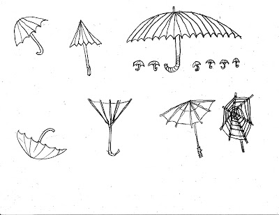
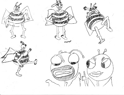
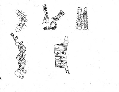
What exactly constitutes a character? Does it have to be anthropomorphic? Can it be symbolic? How recognizable should its intended attributes be? Can a rock petroglyph of a spiral be a ‘character’? Is it ‘complete’? Does a partial close-up of ‘something’ fulfill the definition? These were some of the questions that I wondered about when doing the drawings. My tendency was to first do a lot of different, scattered visual notions, so I was going in a lot of different directions. Was this the right way to do it? Should I be trying to do a coherent, evolutionary ‘series of 30’? I really didn’t know. Not being a good draughtsman, if felt like quick, loose approaches was the way to go. Any attempt to nail down detail, or get any sort of intuitive proportions ‘correct’, wasn’t working, and I didn’t want to get too frustrated. Working ‘small’ helped me not get too wrapped up in drawing difficulties. I tried to draw an idea, and move on. Sometimes I tried to continue an idea from a previous image, and sometimes I completely veered off in a different direction. There was nothing I was completely satisfied with, but I was probably the least dissatisfied with the top row of group #3. It felt like a useful exercise, in that it was hard for me, and there is usually benefit in that.
What exactly constitutes a character? Does it have to be anthropomorphic? Can it be symbolic? How recognizable should its intended attributes be? Can a rock petroglyph of a spiral be a ‘character’? Is it ‘complete’? Does a partial close-up of ‘something’ fulfill the definition? These were some of the questions that I wondered about when doing the drawings. My tendency was to first do a lot of different, scattered visual notions, so I was going in a lot of different directions. Was this the right way to do it? Should I be trying to do a coherent, evolutionary ‘series of 30’? I really didn’t know. Not being a good draughtsman, if felt like quick, loose approaches was the way to go. Any attempt to nail down detail, or get any sort of intuitive proportions ‘correct’, wasn’t working, and I didn’t want to get too frustrated. Working ‘small’ helped me not get too wrapped up in drawing difficulties. I tried to draw an idea, and move on. Sometimes I tried to continue an idea from a previous image, and sometimes I completely veered off in a different direction. There was nothing I was completely satisfied with, but I was probably the least dissatisfied with the top row of group #3. It felt like a useful exercise, in that it was hard for me, and there is usually benefit in that.
Wednesday, January 5, 2011
Monday, January 3, 2011
Subscribe to:
Comments (Atom)


