Sunday, February 20, 2011


Saturday, February 19, 2011


Sunday, February 13, 2011
Assignment #4 - updated character and environment

Allie Brosh's image is the bottom one

I have become a recent fan of Allie Brosh's work at http://hyperboleandahalf.blogspot.com In addition to being a very funny writer, I enjoy her illustrations. Her drawing style is deceptively simple (most of the time), and yet her figures convey a great deal of expression. I enjoyed the simplicity of my previous lightbulb character, but after looking at more of Ms. Brosh's work, I decided I could add a lot more expression to my characters, just by adding some simple eyes and a mouth.
Tuesday, February 8, 2011
Reflective essay #3
Another challenging one for me. Although evironmental sketch #1 is the crudest, it is also the truest to character, for my character. He is an office drone, and lives in a rather drab office environment, which is why there is very little color - it's mostly monochrome. It's also why I placed him in the sketch, even though we weren't asked to; it's partly to show how well he fits in. His two work colleagues are going through the same ritual - tiredly starting to pull out their chairs at the beginning of the work day. Same posture, same motions, same mindset. The only hint of color is the Orwellian non-motivational work slogan on a background of chirpy canary yellow. I used a stock photo of an office to help me lay out the perspective somewhat.
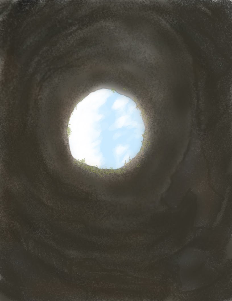
The second one was not entirely to my satisfaction, but I enjoyed doing it. I started with an interior photograph looking up and out of the tower of a ruined Irish castle. Technical challenges abounded. I tried sampling colors from the photograph; and tried using a later-discarded outline to 'try' to map out the areas of the most light. When it ended up not looking very 'interior-tower-like', I ended up trying to make it more 'interior-cavelike'.
I added a few elements to the coastal scene. The distant formations on either side, the close rockface silhouette on the left, and some rocks in the water. I used the erase tool more than anyone will ever know. No, that's not tree-like. Erase. No, that's not rock formation-like. Erase. No, that's not rock-in-the-water like. Erase. The tutorial videos make it look maddeningly easy. "Well, heck, those realistic rock formations just about draw themselves!" Sigh. I sampled colors a lot, punched it up, dialed it down, and experimented with different opacities. And digitally erased a lot. Buy a computer, save a forest.

Monday, February 7, 2011
Sunday, February 6, 2011
Reflective essay #3, part 1
Even though I’ve been in Ashland several years, there are parts of town that I’m not that familiar with, especially ‘above’ main street. Part of the reason for that is that my hips do not always make it easy to go on frequent and long walks. I wanted to get some elevation, and a commanding view of Ashland – and its portion of the Rogue Valley. Someone suggested heading up Wimer St., so I drove to the top of that with my dog, turned right on Thornton, and drove down a little, until someone’s estate finally opened up enough to afford the casual driver. It’s about 2:30-ish in the afternoon. It’s a representational upper-income neighborhood’s view, which is to say, expansive. Take the high ground and hold it. 3, no 4, now 5 deer just wandered into this open area, into the lot in front of me. My dog’s ‘hunt radar’ doesn’t seem to have fully clicked on, although I’m keeping an eye on her. There is someone’s small deck below me, and to the left. A great place for a morning cup of java. The view stops only with the hill ridges, miles away. The sky is fairly hazy, especially lower, close to the ridgeline. On the distant hillsides, shadows are not very dark. What is more noticeable are differences in color & shape in foliage – the way that trees appear, versus the way that fields appear. At a distance, trees don’t really appear as ‘upright thin things’, unless they are alone, and dark green. It does not take that much distance for things to look absurdly small. The farthest hillside looks darker, not lighter, because of the density and type of tree growth. I have no idea how I would draw that hazy a sky with a pencil. The same goes for middle-distance trees. I am perceiving a growth of trees in the distance, but it is because I am recognizing that particular combination of dull color opacities, and relative size, rather than truly recognizing the clear shape of any particular tree. How does that happen, and why do we instinctively reproduce crude, stored symbols, when we are attempting to reproduce such a scene? Why does the brain not instinctively try to ‘do’ a blotched, variegated, ill-defined patch, instead of saying to itself, “ah, a tree, it is tall and thin with sloping vertical branches and needles/leaves, so try to draw the tree five miles away, that way.” I am seeing a coniferous tree in the distance that doesn’t really visually resemble the close-distance conifer in front of me, and yet I know them to be very similar. I can’t see the distant detail, so how does that work? How does one represent these impressionistic splotches of color/shape with something as ‘hard-edged’ as a solid pencil line, and do it convincingly? I don’t know how to do it yet, but obviously there are others who can do it, and do it very well. It’s very quiet up here. There is a very diffused sound of traffic, but it is not clearly recognizable as such. It sounds more like a gentle stream of pressurized air being released in a controlled manner. Colors are muted, except for coniferous trees very close by, in direct sunlight. Being quiet, with a very expansive view, and made up of mostly muted colors, is what makes this place, what it is.


Subscribe to:
Posts (Atom)